
Most business students have to talk about data at some point in their careers. Help your student present and discuss data in charts, graphs and info graphics with this vocabulary class.
In addition to vocabulary, there are worksheets showing various different graphs. To practice, ask your student to explain to their insights on each graph.
Types of charts
Pie chart
Bar chart
A diagram
Line graph
Scatter graph
Info graphic
Parts of a chart
X and Y axis
Dotted lines – the broken lines often used on graphs.
Speaking task
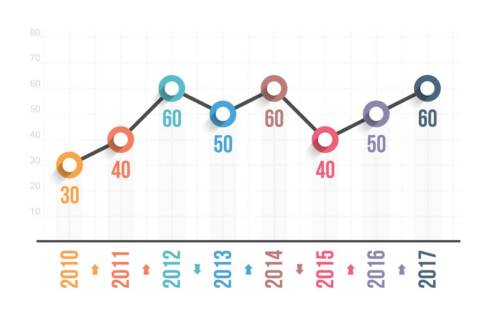
Ask your student to identify these types of charts and graphs. Ask them also to identify the parts of a graph such as the X and Y axis and any dotted lines.
Speaking about data
Increases
Intermediate
To increase, to grow.
‘We have grown our product range 50% in the last 12 months.’
To experience steady growth – to grow slowly and predictably.
‘The company has experienced steady growth for the last two years.’
To peak, a peak – the highest point in a graph.
‘New sign ups to our gym peaked in January.’
To reach a high point – another way to say ‘the peak.’
‘Sales reached a high point in June.’
To surge, a surge – a sudden, powerful move forward or upward.
‘There has been a surge in new bookings this month.’
Advanced
To rocket – to increase dramatically.
‘Take up of this service has rocketed in the last few months.’
To shoot up –a large increase.
‘Sales have shot up this quarter 33%.’
Decreases
Intermediate
To decrease, to drop, to fall.
‘Complaints have fallen by 20% in the last quarter and so this is good news.’
To experience a decrease/ a drop/a fall in something.
‘We have experienced a 30% drop in customers using our physical bank. People now prefer to go online.’
To decline, a decline – another, sometimes more negative way to say ‘a decrease.’
‘Birth rates have been declining in the western world for 30 years.’
Advanced
To plummet, a plummet – a sharp or dramatic fall.
‘Sales of the car plummeted when the company announced that it did not meet the new CO2 emission requirements.’
The lowest point, the trough, the dip – the lowest point in a graph.
‘The trough represents the lowest point in sales. But that’s understandable – no one wants to buy ski equipment in June!’
Adjectives to describe large and small increases and decreases
Small: Slight, tiny, gradual, steady.
Big: Dramatic, steep, significant, considerable, sudden.
Up and down
To fluctuate – when an amount goes up and down rapidly.
‘We have seen fluctuating temperatures all summer. Sometimes it’s as low as 20 degrees and sometimes as high as 40 degrees.’
No Change
To level off
‘Wage growth has levelled off in the last quarter.’
To stay the same
To remain constant/stable
To stabilise
‘Participles of CO2 in the air have finally stabilised.’
Trends and reading data
An insight -a deep understanding of something.
‘This data gave us a good insight on consumer trends.’
To see an upward trend – an increasing tendency or trend.
To see a downward trend – a decreasing tendency or trend.
‘We are seeing an upward trend among young people to enrol in higher education. In comparison we are seeing downward trend in young people starting.’
A trajectory – the path of a curve in a graph.
‘We predict from this trajectory that the global population will be 9.2 billion by 2050.
Ways to present information
To represent
‘This chart represents…’
To show/ to demonstrate
‘This graph shows…’
To illustrate
‘This data illustrates that….’
To describe
‘This info graphic describes…’
Making comparisons
To compare to, in comparison to
As opposed to
Versus
‘The government has increased its spending on healthcare, as opposed to education, where we can see that it has reduced the budget.’
Speaking task
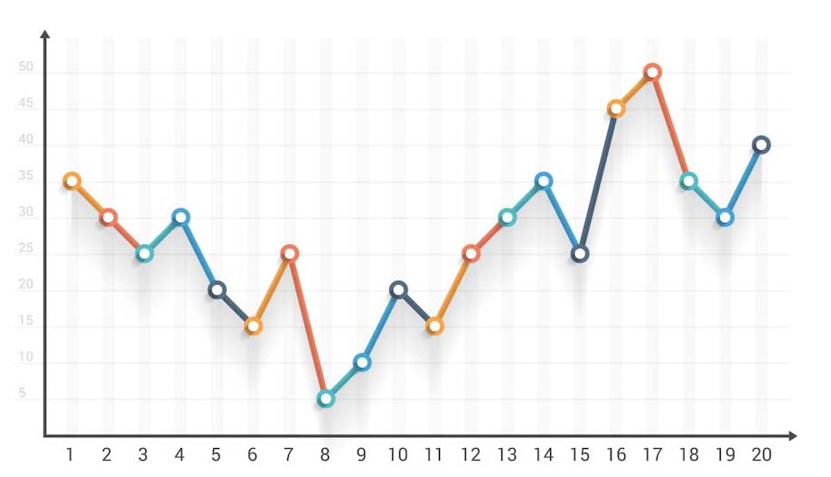
Using the same worksheet, ask your student to describe the different charts and tell you what they see in the data.
Percentages
Percent – specified amount in or for every hundred.
Percentage point – arithmetic difference of two percentages.
NOTE: There is an important difference between ‘percent’ and ‘percentage point.’
“A percent point is the unit for the arithmetic difference of two percentages. For example, moving up from 40% to 44% is a 4 percentage point increase, but is a 10 percent increase in what is being measured.”
Source Wikipiedia.
If your student has to talk about data for their work, make sure that they understand the difference.
A proportion – a part, share, or number considered in comparative relation to a whole.
‘The proportion of the population with a university degree has steadily increased since the turn of the century.’
Number + out of + number (not ‘from’).
‘Seven out of 10 people prefer dogs to cats.’
More than/ greater than – >
Less than – <
Numbers
Remember: Large numbers are separated by a comma in English, not a point.
For example: 1,327,564 (not, 1.327.564)
AND: Fractions are written with a decimal point in English, not a comma.
For example: 4.3 and 6.7 (not, 4,3 and 6,7).
Homework and final thoughts
Data journalism is exploding across the internet and makes very interesting topics of conversation. Ask your student to read a data story for homework and explain to you the graphs in the next lesson.
Places to find data journalism stories:
The Upshot, from the New York Times
Worksheets
Finally, here are some excellent worksheets to give for homework to practice this vocabulary, from tutor Gareth J.
Andromeda
Andromeda is a Fluentify English tutor. She has been teaching English in Spain and online since 2012. In addition to teaching, she is a TEFL writer. She recently moved to Edinburgh, Scotland and is currently working on her Scottish accent.